


7 examples of good headlines
A good headline is designed to do one main thing:
Attract the readers attention!
You can attract attention through a headline in many ways:
- Surprise: "Oops! We goofed..."
- Descriptive: "The quiet toy"
- Emotional: "I didn't get the job..."
- Reverse Psychology: "10 reasons NOT to buy a Volkswagen..."
- Intrigue: "Don't watch TV tonight. Play it!"
- Features: "This has something your stereo system doesn't..."
- Funny: "Twoallbeefpattiesspecialsaucelettucecheesepicklesonionsonasesameseedbun"
Here's 7 examples of great headlines that use these types of emotional triggers to get people to read their ads:
#1.) Grabbing headline Pop-Tart Ad
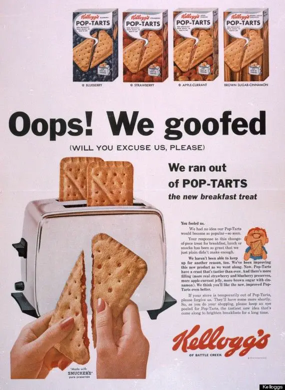
This headline created a "surprised" emotion with the giant headline “Oops! We goofed”
I didn’t WANT to read the smaller print of this 1964 ad, but HAD to with this headline!
Since it got me with the headline, it runs me down the "Slippery Slope" to the small copy which examples they’re out of stock of Pop-Tarts because they’re so popular.
#2.) “The Quiet Toy” Crayola Ad
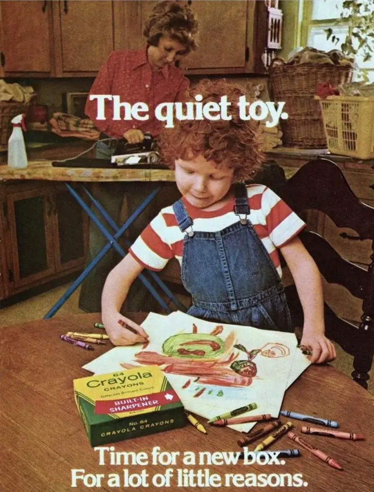
This 1979 Crayola ad uses a descriptive headline to appeal to parents who want their kids to sit and be creative (AND QUIET!!) for a few minutes.
Whoever wrote this ad knew what they were doing 😏
This headline clearly appeals to parents who would **just-for-a-bit** play with a toy that keeps them quiet.
#3.) Heart-tugging Gillette shaving ad
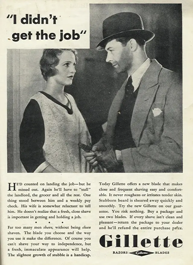
This ad pulls a few heartstrings saying “I didn’t get the job” from a man who hasn’t shaved.
You can clearly feel the disappointment on the man and his partner through the combination of this headline and image.
#4.) “Ten Reasons NOT To Buy” reverse psychology Volkswagen ad
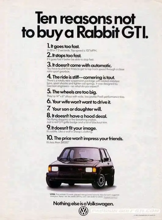
This ad uses some reverse psychology to get your to read it by saying why NOT to buy the car 🤔
Since this headline grabbed us to read it the rest of the copy, you realize these are all ACTUALLY great reasons to buy the car!
#5.) Great headline for Atari ad
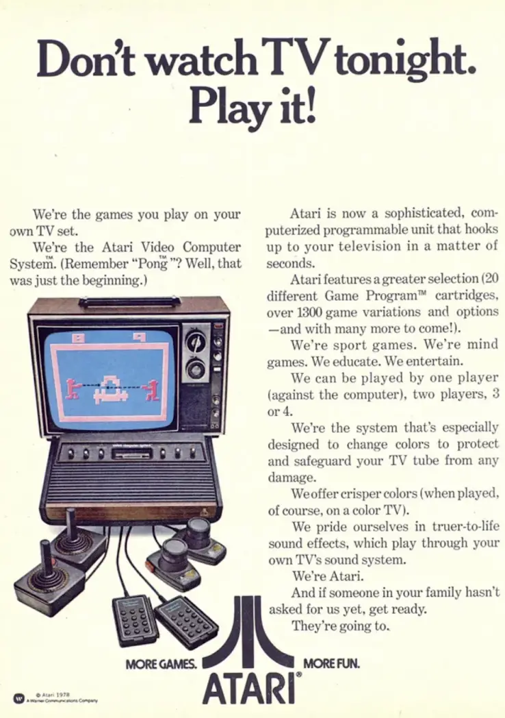
This was a great headline in 1978 that causes some intrigue in your brain, since “Playing the TV” was a totally new and novel concept at the time!
#6.) Awesome 1980 Boom Box print ad
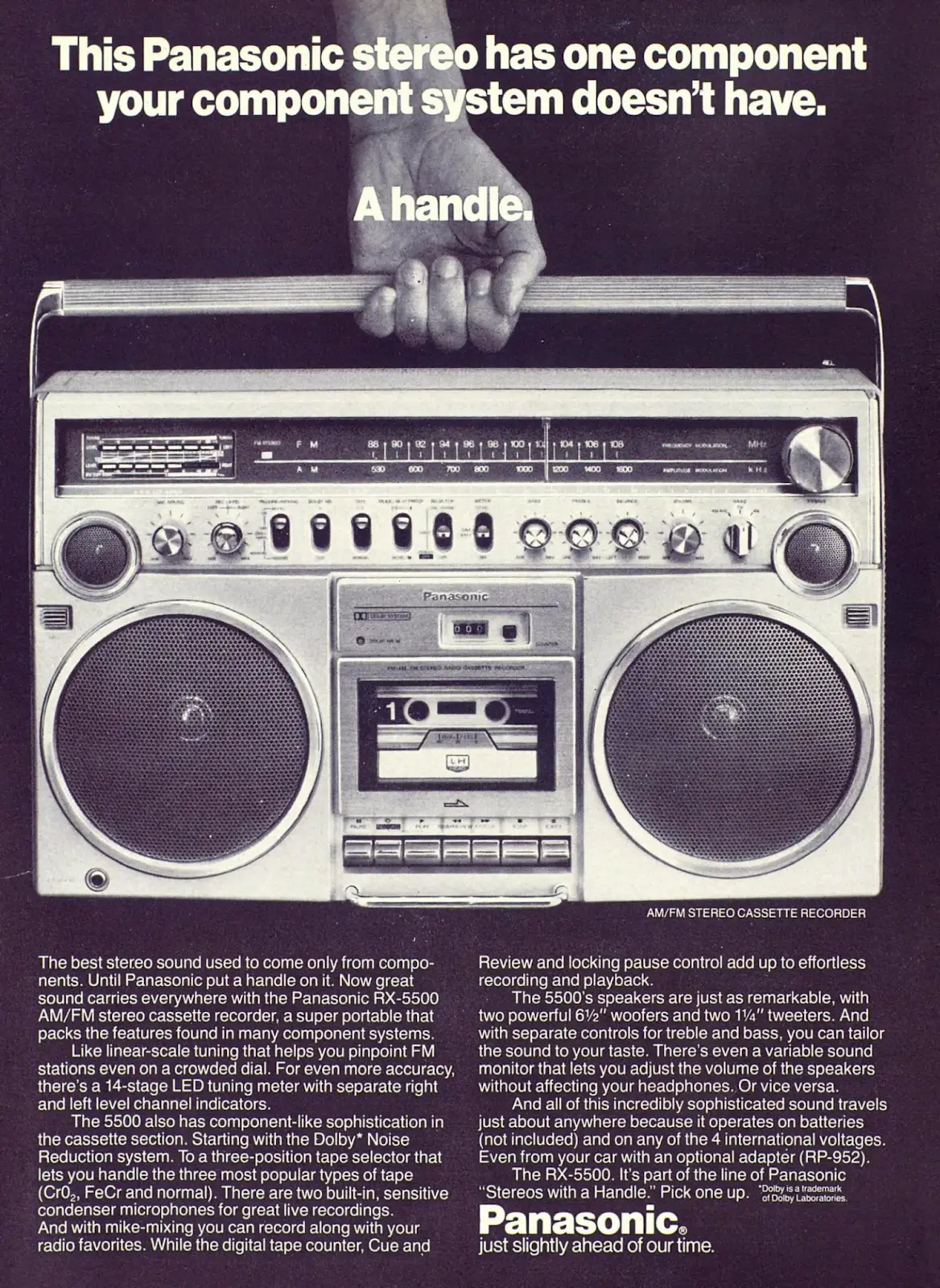
I love the simplicity and grabbiness of this ad, and how it focuses on one major feature of this stereo: A handle.
It shows that by buying this stereo “boom box” you can take your music anywhere.
#7.) Tasty looking Big Mac ad from 1979
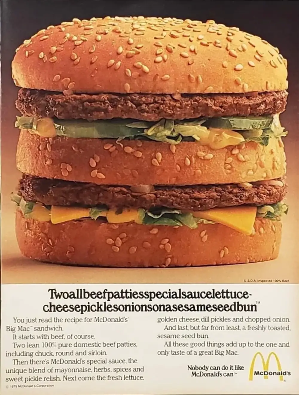
This is a tasty looking Big Mac ad from 1979 that has a very funny headline.
Both the image AND headline are quite grabbing!
The inside joke on this one was from a McDonald's in the 1970's where people say this sentence very quickly:
"Two-all-beef-patties-special-sauce-lettuce-cheese-pickles-onions-on-a-sesame-seed-bun"
Remember, a headline is designed to be the top of a "Slippery Slope" that pulls readers in so they can read the next line:

You can attract attention through a headline in many ways:
- Surprise: "Oops! We goofed..."
- Descriptive: "The quiet toy"
- Emotional: "I didn't get the job..."
- Reverse Psychology: "10 reasons NOT to buy a Volkswagen..."
- Intrigue: "Don't watch TV tonight. Play it!"
- Features: "This has something your stereo system doesn't..."
- Funny: "Twoallbeefpattiesspecialsaucelettucecheesepicklesonionsonasesameseedbun"
Hope this helps you write some great headlines!
Sincerely,
Neville Medhora - Copywriter
13 Comments
Recommended Comments
Create an account or sign in to comment
You need to be a member in order to leave a comment
Create an account
Sign up for a new account in our community. It's easy!
Register a new accountSign in
Already have an account? Sign in here.
Sign In Now