


Copywriting Examples and Case Studies: Companies Doing Copywriting Right
Simply changing the copy on a product can completely change the outcome!

Great copywriting is the underlying tool that can transform bad marketing into good marketing, so let's jump into some examples of good copywriting across several different industries:
Quick Jump
- #1.) The Best Way to Support Your Customer
- #2.) Accept customer data from anywhere in the universe.
- #3.) Engage your customers, everywhere. From one place.
- #4.) Shift design to a new dimension
- #5.) One work platform with endless possibilities
- #6.) Software Differently
- #7.) Note taking on a whole new level
- #8.) Everything you need for your website
- #9.) Headline of Rolls Royce Ad
- #10.) Classic Car Ads (“Ogilvy Layout”)
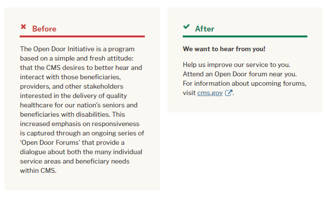
- #11.) Making "Warning Labels" Easier With Bullet Points:
- #12.) 1953 Revere Ware Ad
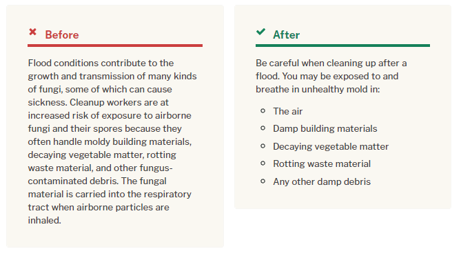
- #13.) Removing "Excess Words" For Easier Reading
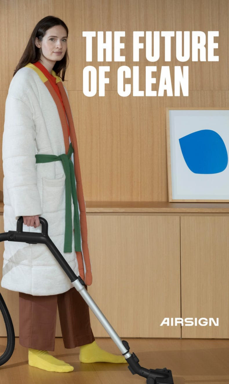
- #14.) AirSign Social Media Campaign
- #15.) "Bullet-ize" Anything That Can Fit Into A List:
- #16.) How To Create Advertising That Sells by David Ogilvy
- #17.) Kernest email
- #18.) TheHustle Boss Email
- #19.) Bose Black Friday Email
- #20.) MixPanel Account Upgrade
- #21.) AIDA Formula for email
- #22.) Weekly Newsletter Example
- #23.) Daily Newsletter Example
- #24.) Website Copywriting Improvement:
- #25.) B2B Sales Email Improvements:
- #26.) Brick-n-Mortar Store Street Sign Advertising:
- #27.) Long-form Website Copy Example:
- #28.) Service Business Copywriting Example:
- #29.) The Hustle Funny "Four Loko" Giveaway (Email):
- #30.) The Hustle Funny "Four Loko" Giveaway (Email):
- #31.) Ramit Sethi’s Survey Request (Email):
- #32.) BarkBox’s “How this works” section
- #33.) Ecommerce Stores email marketing
- #34.) Noom’s Pricing Page
- #35.) The Glute Guy’s Diet Chart
- #36.) Dom, Domino’s Chatbot
- #37.) Swet Tailor’s Facebook Ad (with Callouts)
- #38.) The 4 Hour Chef Sales Page
- #39.) Tuft and Needle Sales Page (12 Reasons Why…)
- #40.) Apartment Follow Up Email
#1.) The Best Way to Support Your Customer
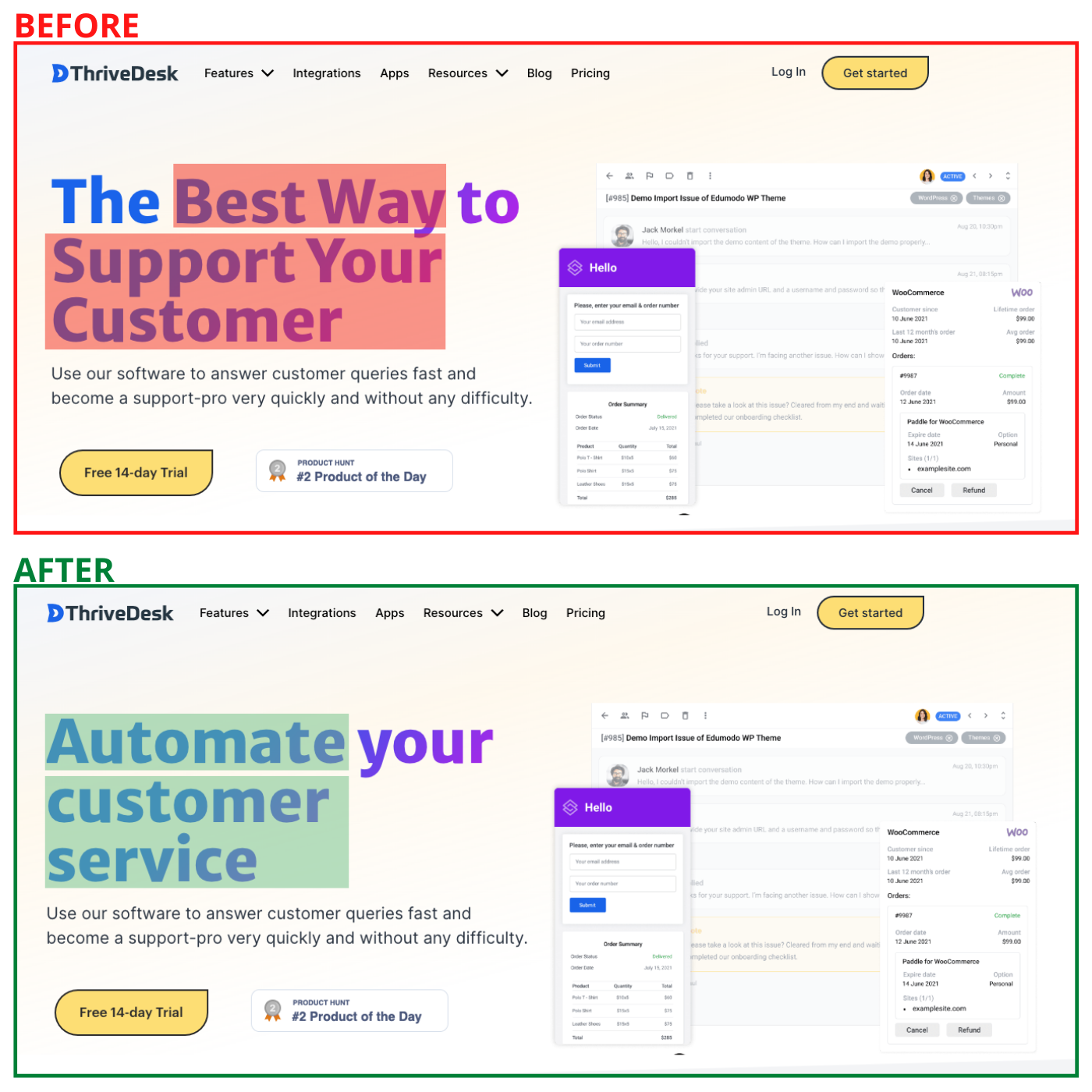
Before: The Best Way to Support Your Customer
This could mean anything at any stage of a customer engagement.
After: Automate Your Customer Service
It clearly states that this is an automation tool. Also, customer service is more specific than “support your customer”.
#2.) Accept customer data from anywhere in the universe.
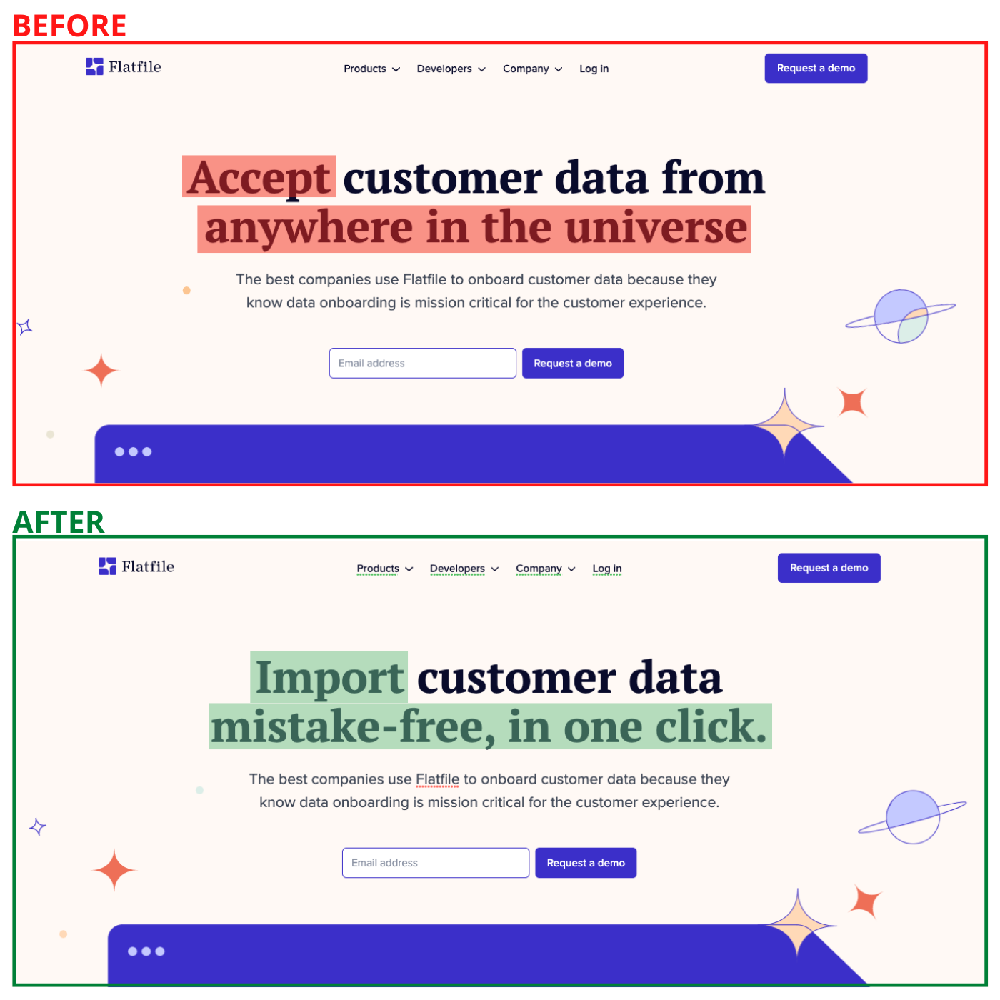
Before: “Accept customer data anywhere in the universe. It’s clever, but isn’t the main benefit.
After: Import customer data mistake-free, in one click. We deleted the line about the universe and replaced it with a more specific benefit (“mistake-free”). This just makes it easier to understand, and also adds more benefits into that one sentence.
#3.) Engage your customers, everywhere. From one place.
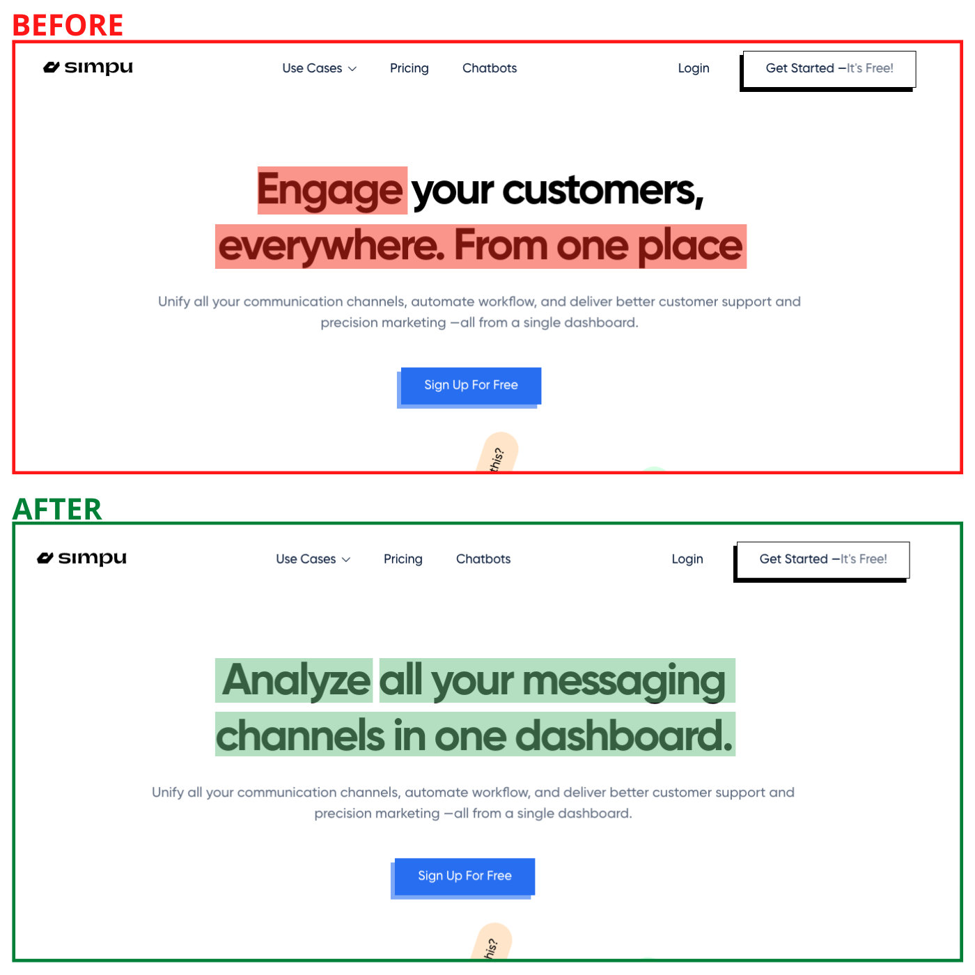
Before: “Engage your customers, everywhere. From one place”. It’s not clear what an “engagement” is. “Everywhere” is too broad, and it’s not clear what their “from one place” looks like.
After: “Analyze all your messaging channels in one dashboard”. We rewrote it to focus on one clear benefit (analyze all your messaging) and one clear feature (one dashboard).
#4.) Shift design to a new dimension
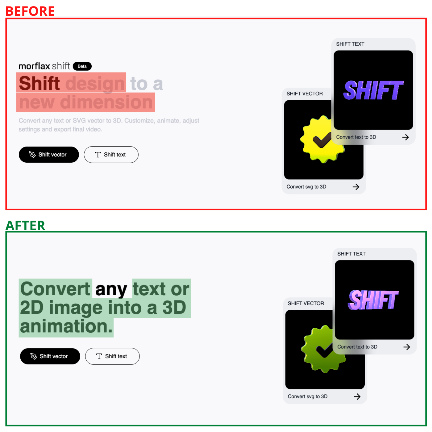
Before: “Shift design” and “new dimension” were quite confusing.
After: We showed a real-world use to describe the software.
#5.) One work platform with endless possibilities
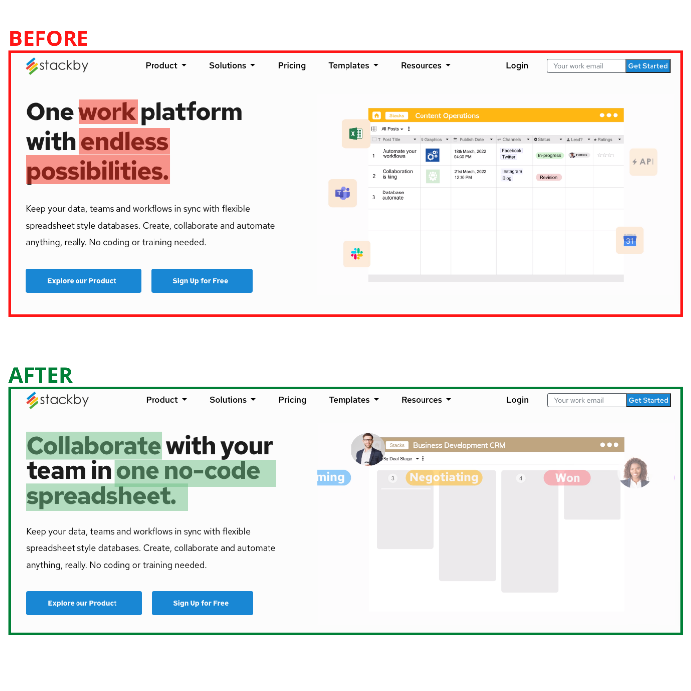
Before: “Endless possibilities” didn’t describe anything, and those words didn’t earn their pixels to be on the page.
After: We used a more specific benefit (“collaborate with your team”) and even threw in “no-code” for a strong sentence that describes the product.
#6.) Software Differently
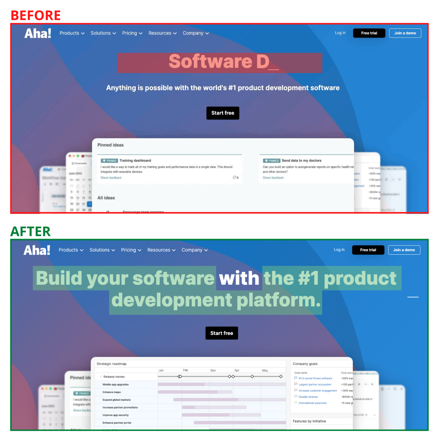
Before: “Software boldly/differently/joyfully” wasn’t very clear.
After: We described the product in one sentence so a new visitor can quickly understand what the company does.
#7.) Note taking on a whole new level
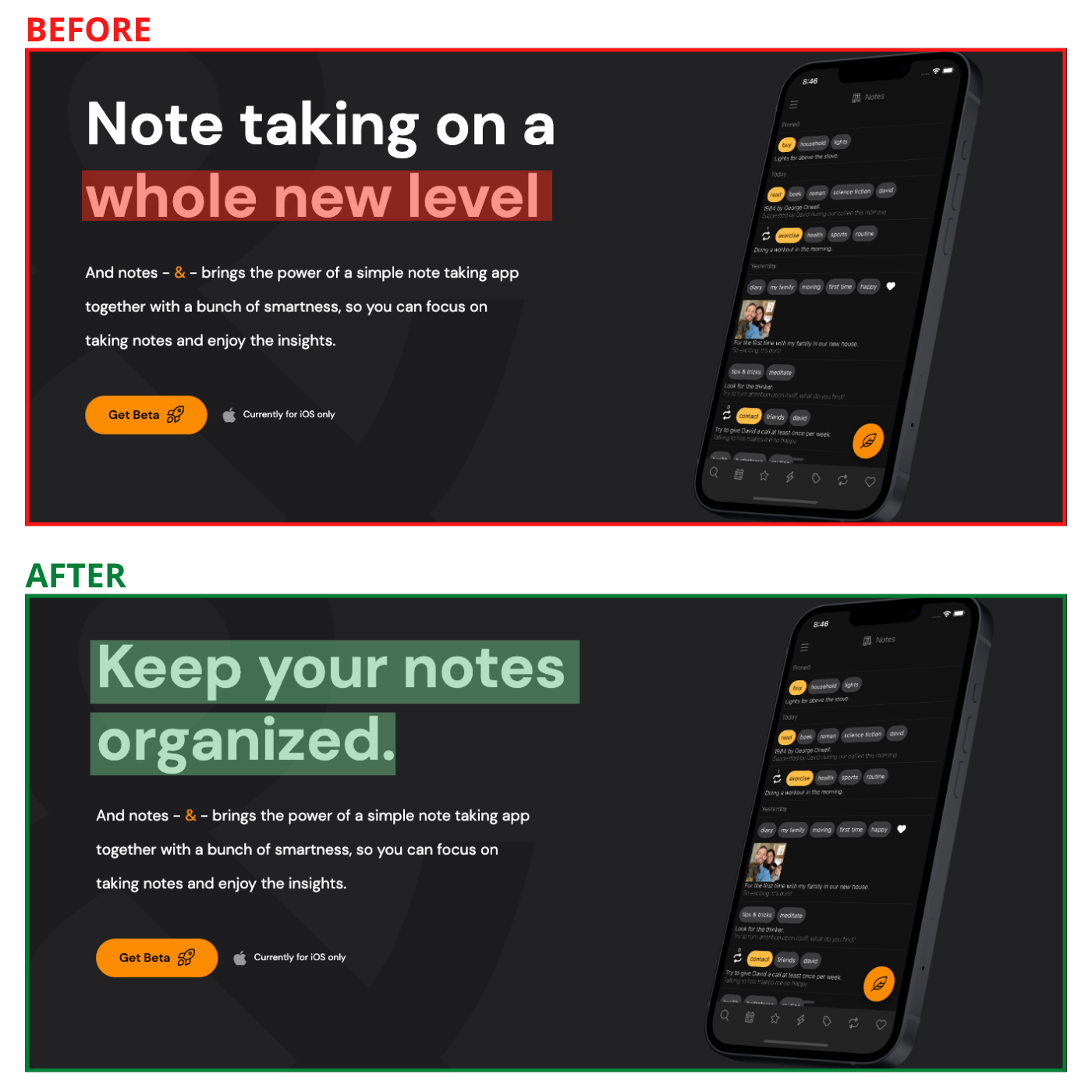
Before: The phrase “a whole new level” was vague about what it’s talking about.
After: We showed the main benefit of “Keep your notes organized” front and center.
#8.) Everything you need for your website
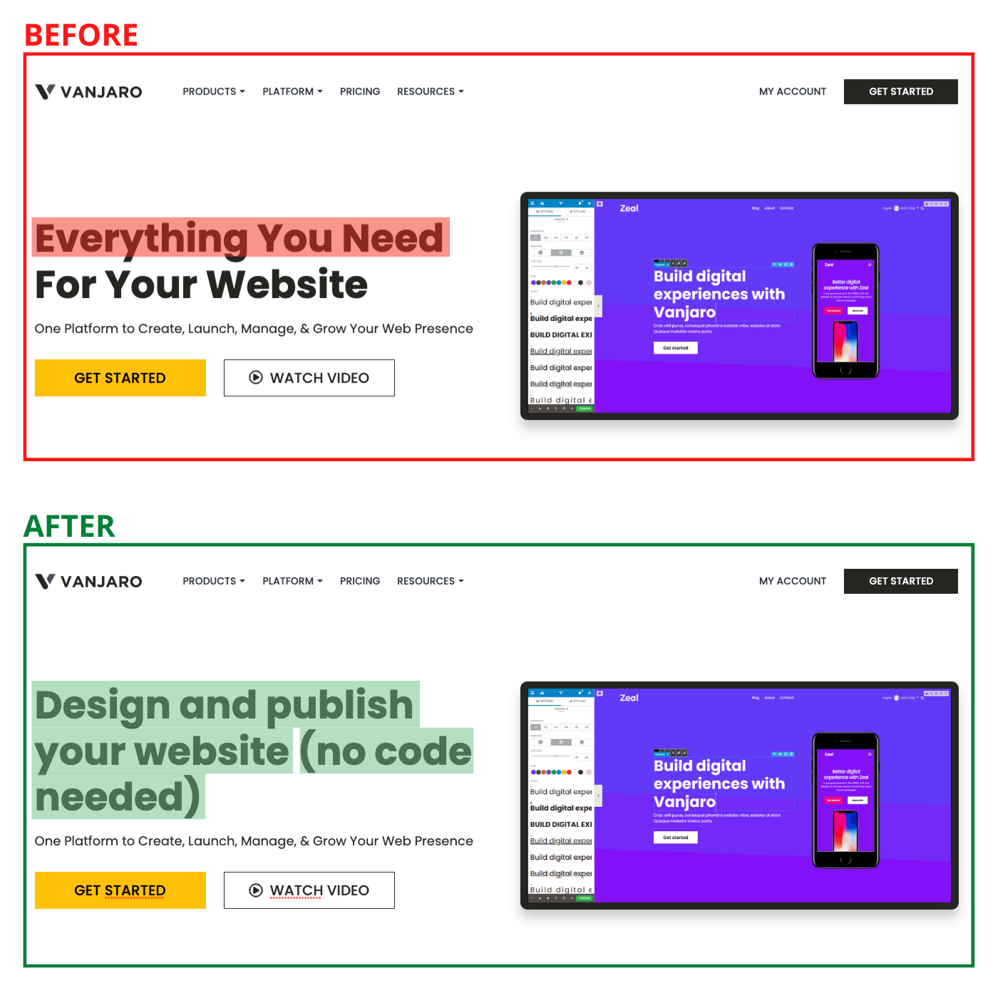
Before: “Everything you need” is very vague. What does that really mean?
After: We wrote that you can “design and publish” your website, and even do it with no code. That small change really helps.
#9.) Headline of Rolls Royce Ad
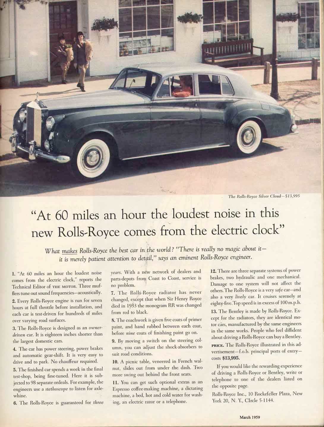
This ad shows a cool car plus the headline:
“At 60 miles an hour the loudest noise in this new Rolls-Royce comes from the electric clock.”
It’s powerful, letting the eye naturally flow from image to headline to copy.
It’s the basis of most digital content (like blog posts).
It laid the groundwork for digital ads (most Facebook Ads have a similar structure).
#10.) Classic Car Ads (“Ogilvy Layout”)
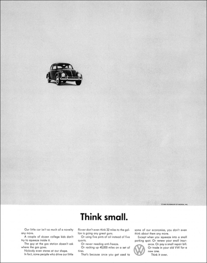
VW’s “Think Small” campaign was built by Julian Koenig and Helmut Krone, but it follows a familiar format often used by David Ogilvy (including on the Rolls Royce ad above):

Krone even referred to this format as the “Ogilvy layout”.
What Was Great About It:
- It’s powerful, letting the eye naturally flow from image to headline to copy.
- It’s the basis of most digital content (like blog posts).
- It laid the groundwork for digital ads (most Facebook Ads have a similar structure).
#11.) Making "Warning Labels" Easier With Bullet Points:
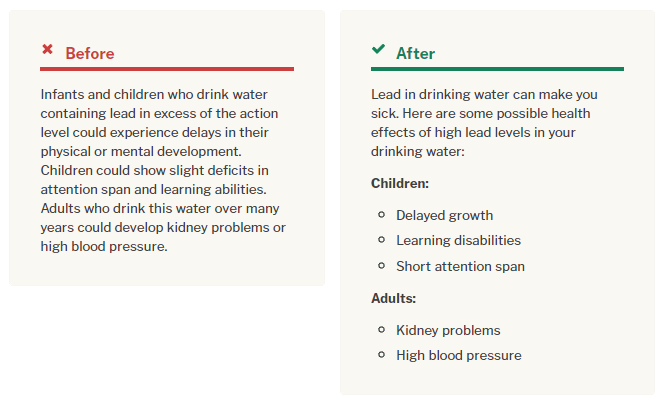
Sometimes good copywriting can be life-saving, like in this example where complex instructions become easy through bullet points.
What Was Changed:
1.) The instructions were divided up by "Children" and "Adults" so people don't confuse them.
2.) The instructions were put into bullet points for easy understanding of the effects of drinking lead. These small changes drastically increased the readability!
#12.) 1953 Revere Ware Ad
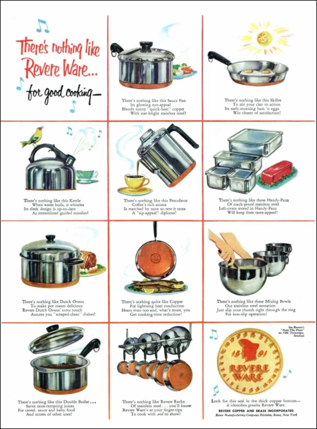
This is a simple and effective print ad showcasing the entire lineup of a cookware brand, and it gives an image and quick description of each product.
#13.) Removing "Excess Words" For Easier Reading
A critical issue in many pieces of writing is lots of extra words than don't need to be in the copy!
Unless the copy is mission critical, you can often ditch it:
What Was Changed:
You can notice the "Before" text is almost completely unnecessary. 70% of that text could simply be removed to convey a simple message, and then if more details are needed people can click the link.
#14.) AirSign Social Media Campaign
#15.) "Bullet-ize" Anything That Can Fit Into A List:
Whenever you can, spare people lots of reading by simply "Bullet-izing" items:
What Was Changed:
A big (and boring) block of copy was trimmed down to an intro sentence, and then list items were put into a bullet list. This makes comprehension MUCH higher, and takes LESS work on our part asa copywriter!
#16.) How To Create Advertising That Sells by David Ogilvy
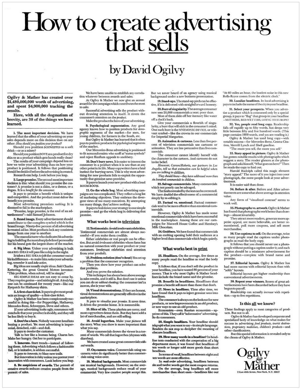
This was an advertising campaign written by David Ogilvy for his agency where they just gave out all their secret sauce.
Because this was such a “juicy” piece of content, people would clip it out of magazines and save it.
Ironically “giving away” all their secrets brought in $1.8billion worth of business (in 1960’s money) 😬
#17.) Kernest email
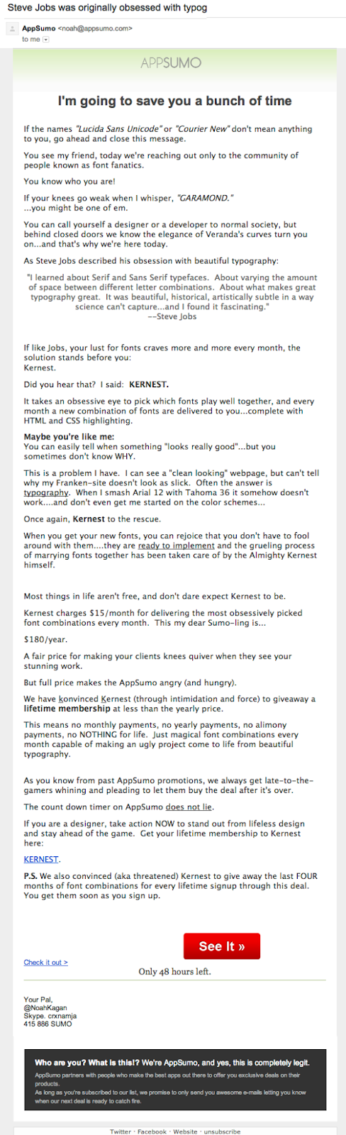
This was the first email I wrote to the AppSumo email list, and it was the first email to break $10k in profit.
#18.) TheHustle Boss Email
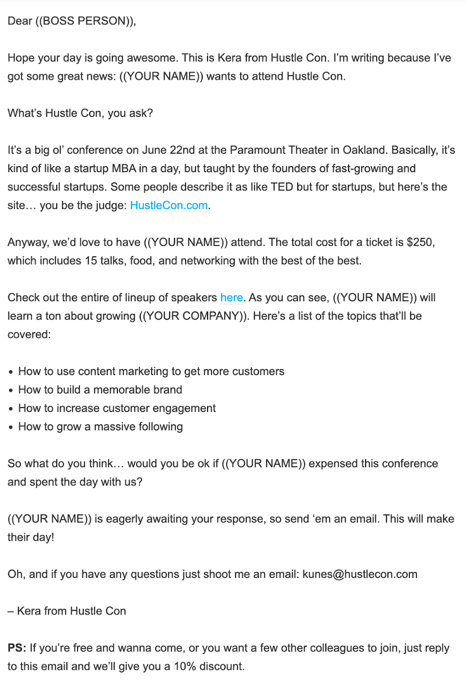
“Hands down the easiest way to get a free ticket to Hustle Con”
…is how this page starts.
It then gives a user an email template to mail their boss asking for time off and a few hundred bucks to attend the conference.
Worked so well!
#19.) Bose Black Friday Email
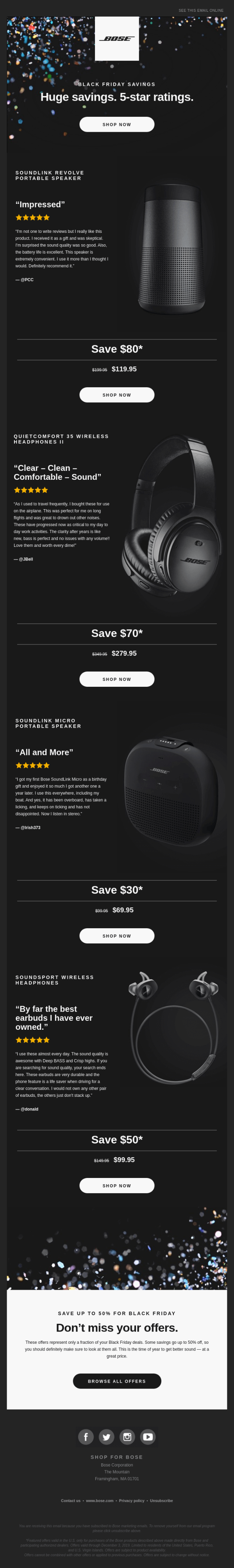
This is an example of an email where the product images are more showcased than the copy.
If you have a product to SHOW, you don’t need to describe it a ton.
#20.) MixPanel Account Upgrade
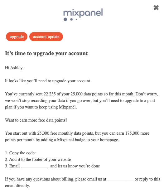
This email designed to upgrade customer to a paid tier. They copywriter was clever and made a win win situation even if the client didn’t upgrade.
They obviously need more space. If they don’t want to pay, the solution is to let MixPanel advertise on there website.
#21.) AIDA Formula for email
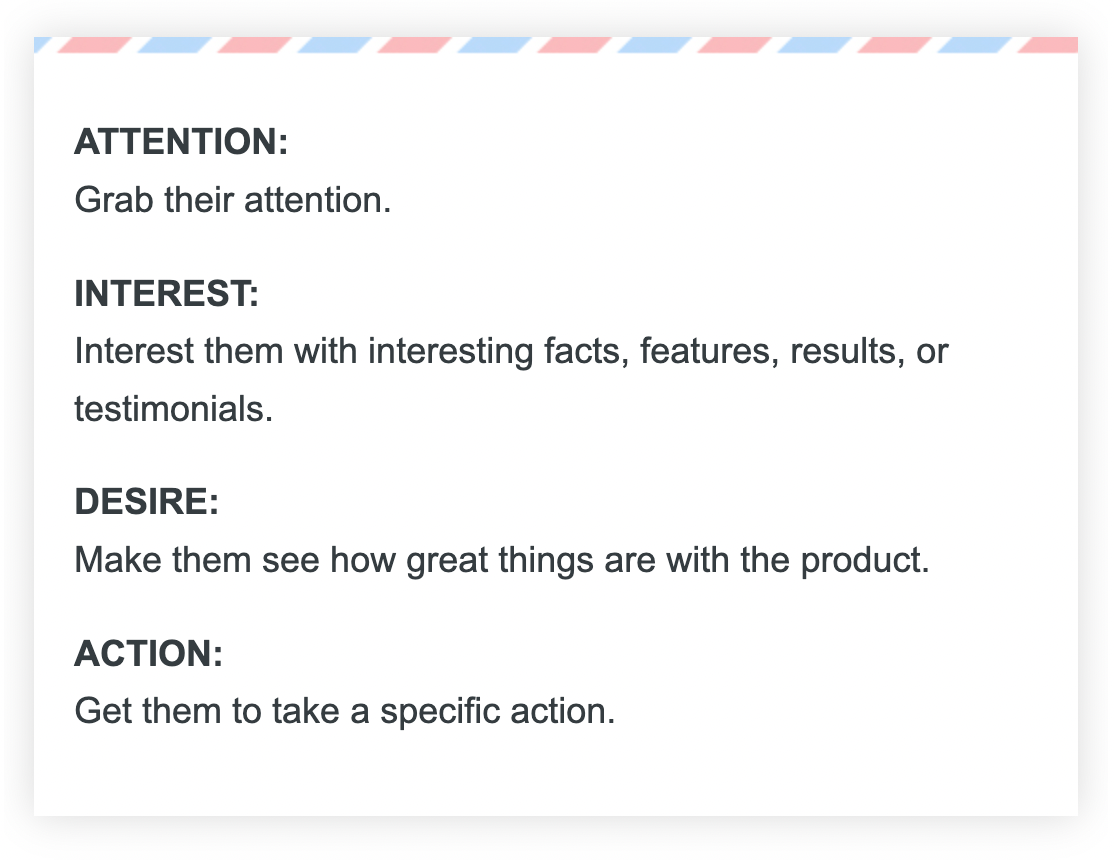
This is the classic AIDA formula designed to get someone from catching their interest, making them read all the way through, and then take an action.
#22.) Weekly Newsletter Example
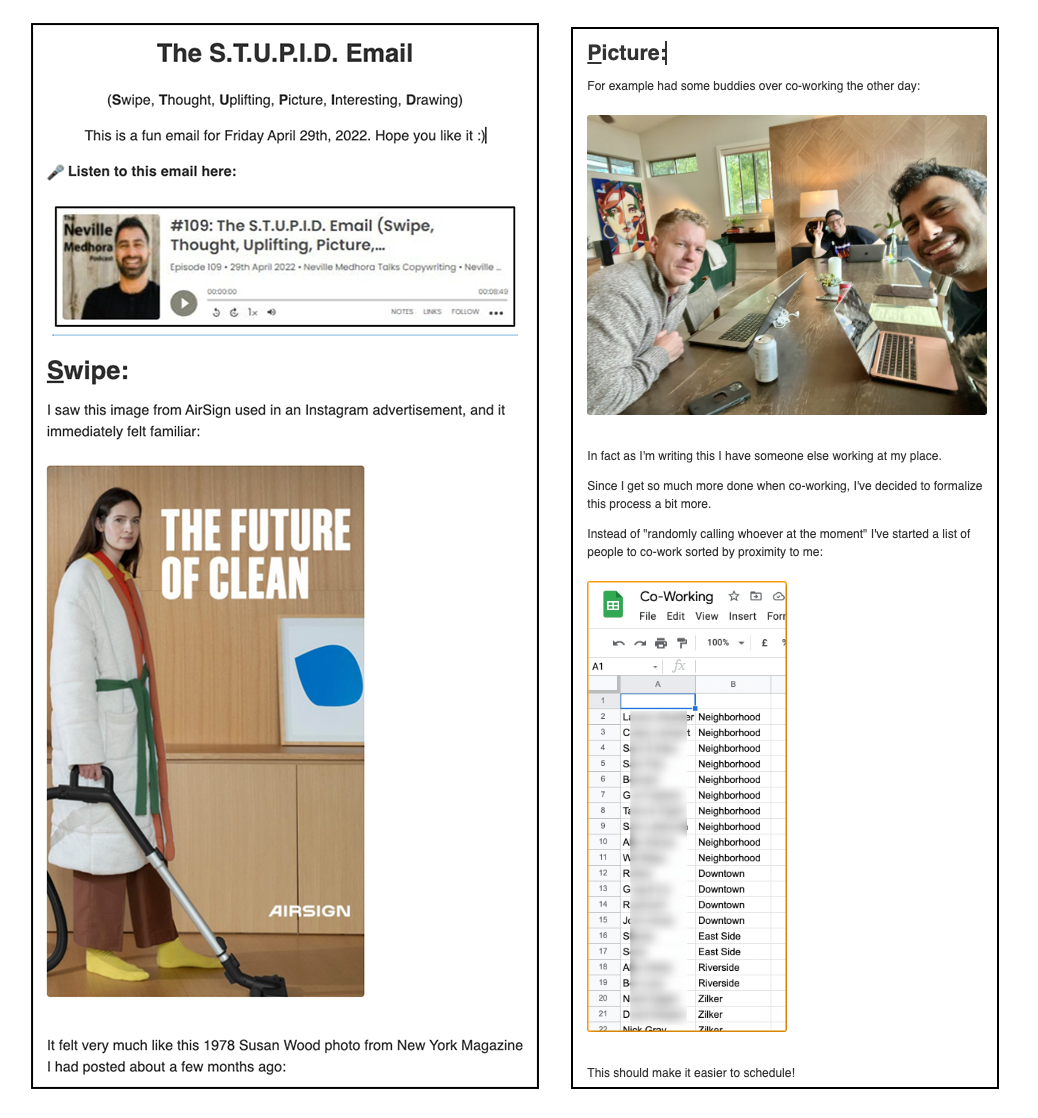
This is an email called “The STUPID Email” by me!
If you’re a semi-regular poster on social media, you can make a “Templated Newsletter” like this.
STUPID stands for:
• Swipe
• Thought
• Uplifting
• Picture
• Interesting
• Drawing
You can learn more about how to create a weekly newsletter here:
https://copywritingcourse.com/blogs/20-how-to-build-a-weekly-newsletter/
#23.) Daily Newsletter Example
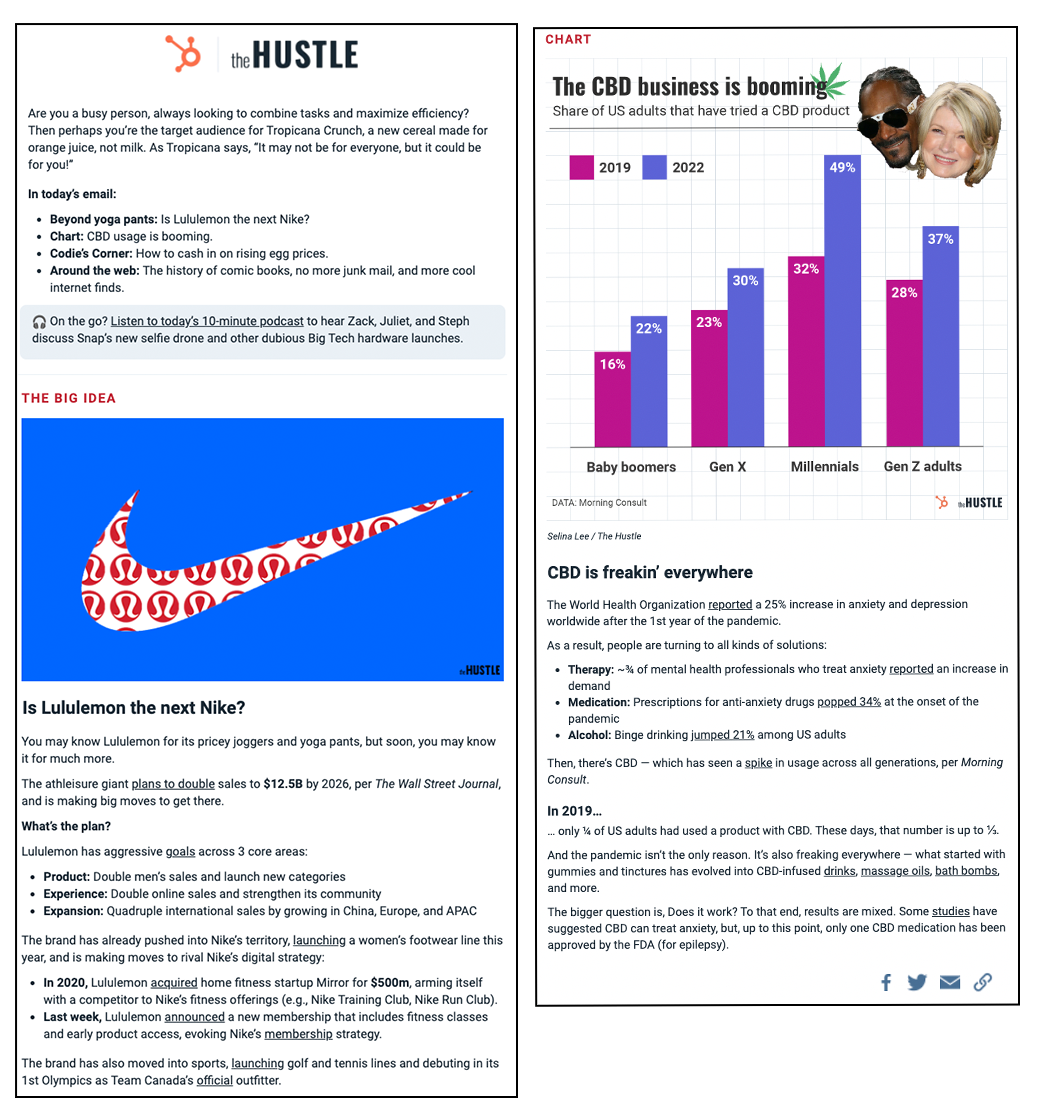
This is a daily newsletter than goes out from TheHustle.
#24.) Website Copywriting Improvement:
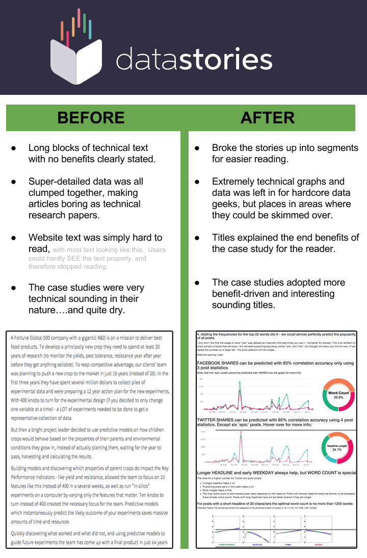
They are a hardcore data analytics company run by engineers, which is great. However the original case studies were coming off very dry and unappealing. Too much technical data and no simplification of it caused this.
The basic principle DataStories changed:
People prefer something that's enjoyable and easy to read. Even if it's super technical information, you can break it up to be nice and digestible. On the internet you can use text, images, video, interactive graphs.....so use them if they help convey information better!
#25.) B2B Sales Email Improvements:
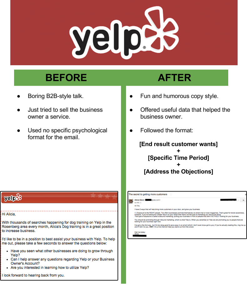
The basic principle these Yelp emails changed:
You know what people hate? Someone just trying to sell them something out of the blue. You know what people love? When you send them legitimate ways to increase their business. The new Yelp emails sounded way more personal, AND offered way more great information for the business owner. A double-win.
#26.) Brick-n-Mortar Store Street Sign Advertising:
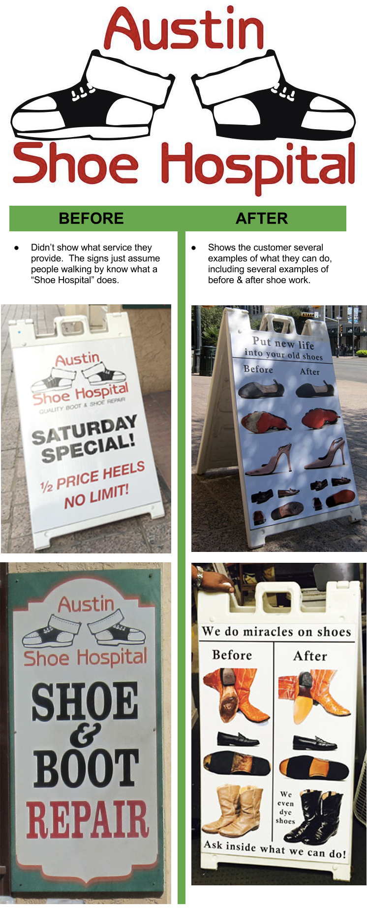
The basic principle these street signs changed:
Not everyone knows what a shoe hospital does, or all the services they perform. So why not just tell people......better yet, why not just SHOW them? In a small amount of space, these signs educate potential customers they could have these services done to their shoes.
#27.) Long-form Website Copy Example:
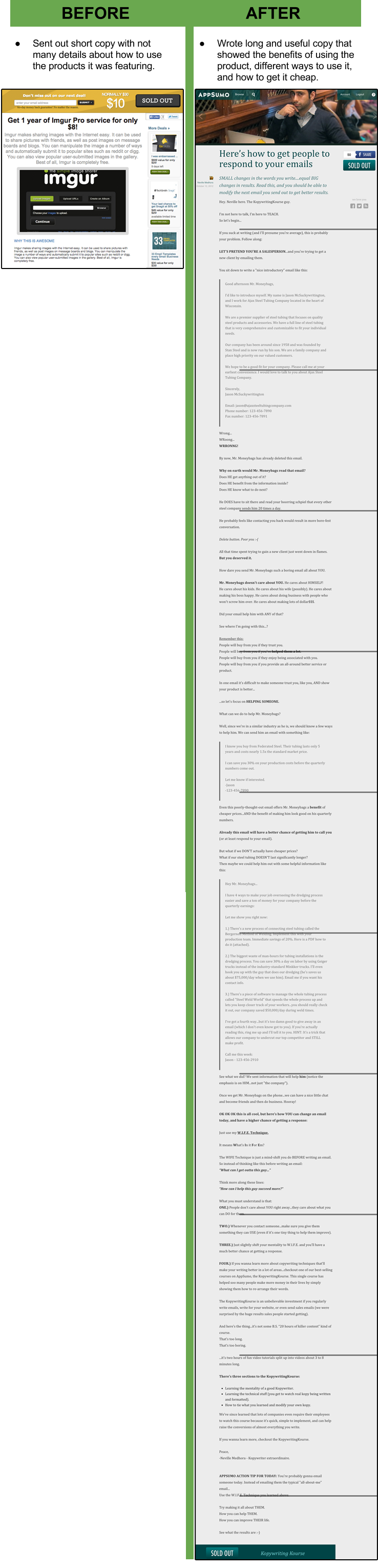
The basic principle AppSumo changed:
A certain amount of people will know exactly what a piece of software does, and buy it on the spot. However a HUGE amount of people probably don't know what it does, and would like to know how it could help them. In this case, long-form copy that went into reasonable-depth of how to use the product drastically helped.
#28.) Service Business Copywriting Example:
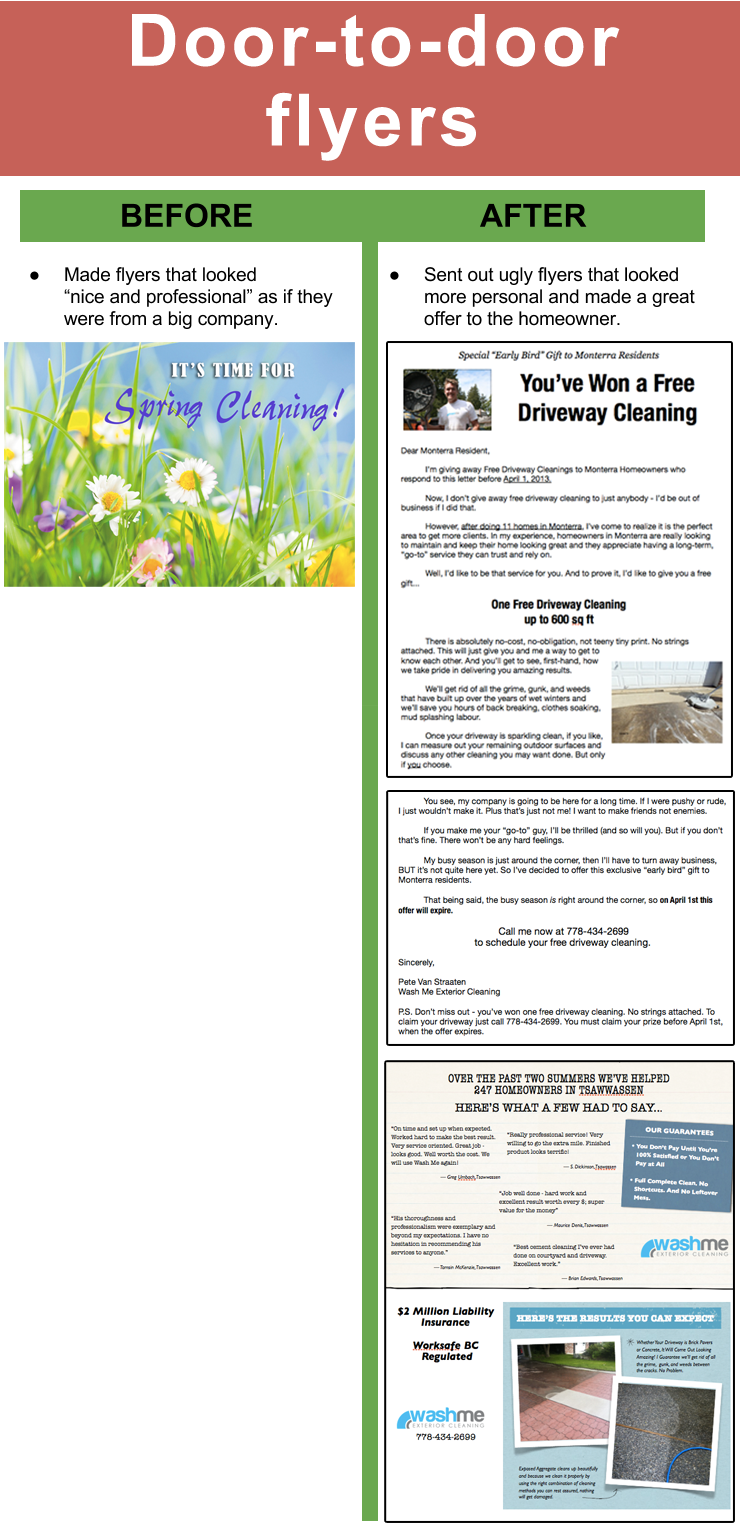
The basic principle these powerwashing flyers changed:
These flyers broke out of the generic-looking and non-informative marketing box. They look and sound very personal, and offer an irresistible deal!
#29.) The Hustle Funny "Four Loko" Giveaway (Email):
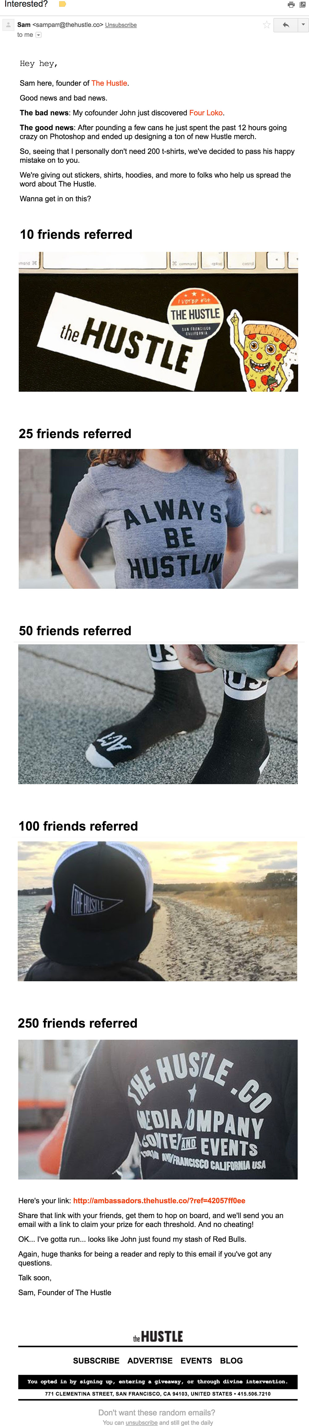
A free giveaway is mildly exciting, so why not spice up your promotion with a little humor? The Hustle did a great job of this with this giveaway over email:
What Was Great About It:
1.) A fun intro to the email gets people hooked.
2.) Super clear numbers show how many people you need to refer for each corresponding prize. These small touches made this a very successful email! Full email.
#30.) The Hustle Funny "Four Loko" Giveaway (Email):
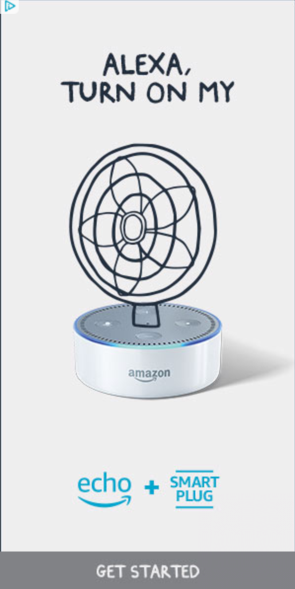
Who says great copywriting needs to be long and complex? These insanely simple Amazon Alexa ads did everything they needed to, with less than 10 words total:
Smaller Square Version of ad:

What Was Great About These:
1.) These ads actually EDUCATE people that you can do such things as turn on a fan through Alexa. Many people may not know that's possible, so this gets them interested enough to click.
2.) They are so brief and explanatory with few words and simple image, they don't need much else. Great copywriting is about transmitting information from one brain to another brain in the most efficient way possible, and these are great examples!
These simple ads worked brilliantly! See original Alexa ads.
#31.) Ramit Sethi’s Survey Request (Email):
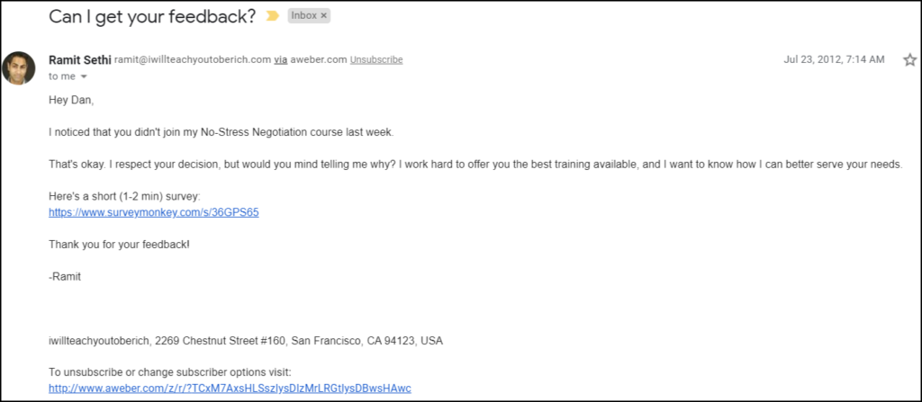
What Was Great About It:
- It’s relevant (it was delivered a week after the sale)
- It’s short, direct, and polite.
- It tells you how much time it’ll take (1-2 minutes).
All that makes it easy to say “yes”.
#32.) BarkBox’s “How this works” section
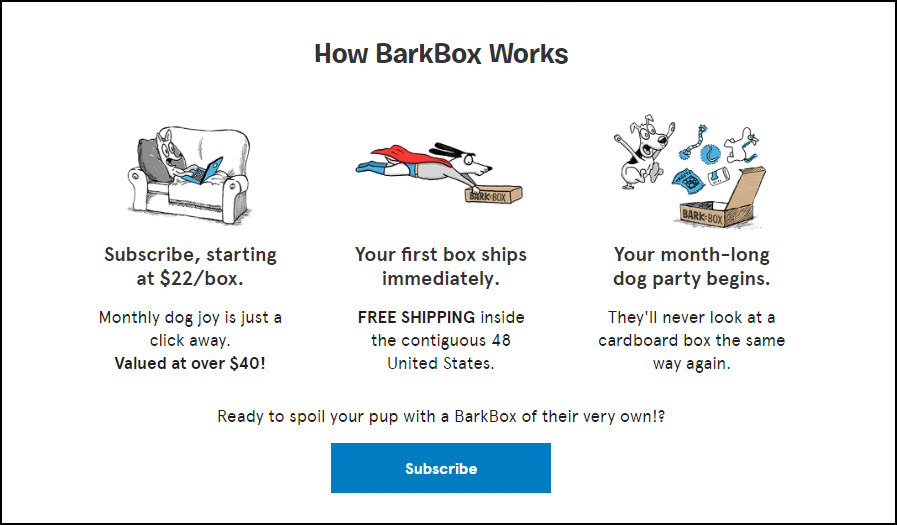
BarkBox offers subscription boxes for your pet dog. Their homepage lays out exactly how to order, what pricing is like, and what to expect.
What Was Great About It:
- The images make the section eye-catching, engaging, and fun.
- The copy tells you everything you need to know (price, schedule, what to expect).
- It’s simple and leads to an easy CTA.
#33.) Ecommerce Stores email marketing
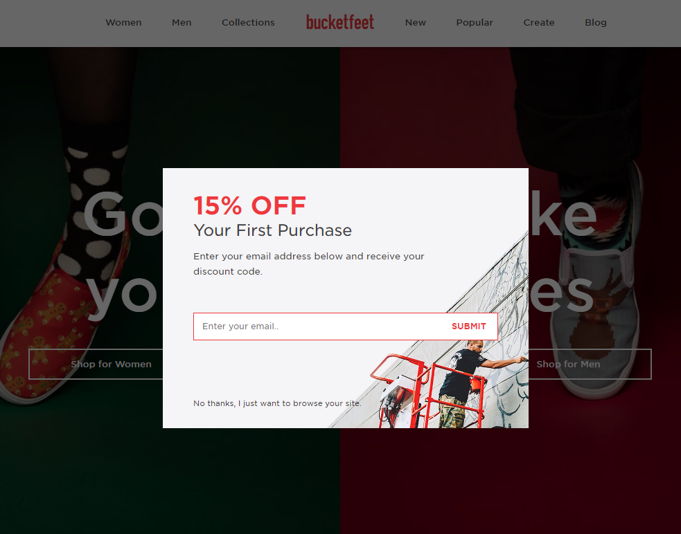
MeUndies and Bucketfeet are two ecommerce stores with a heavy emphasis on email marketing. They put their email opt-ins front-and-center with a pop-up and a 15% discount for new buyers.
What Was Great About It:
- They’re direct and not gimmicky. It’s really easy to give them your email.
- If you don’t want to opt in, it’s just as easy to say No.
#34.) Noom’s Pricing Page
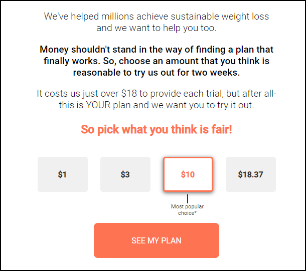
Noom is a weight loss app with personalized coaching programs. They offer a discounted trial for users to get their feet wet - but they don’t just name a price, they get you to select one of four price options.
What Was Great About It:
- They push you towards a $10 selection by calling it their “most popular choice” and highlighting it with an orange box.
- They claim your trial costs them $18 - a price anchor that makes all the options look like great deals.
#35.) The Glute Guy’s Diet Chart
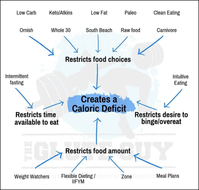
What Was Great About It:
- It breaks down a complicated question (What diet should I choose??) into a simple point (“just create a caloric deficit”).
- It’s easy to remember and share.
- It’s well-organized.
#36.) Dom, Domino’s Chatbot
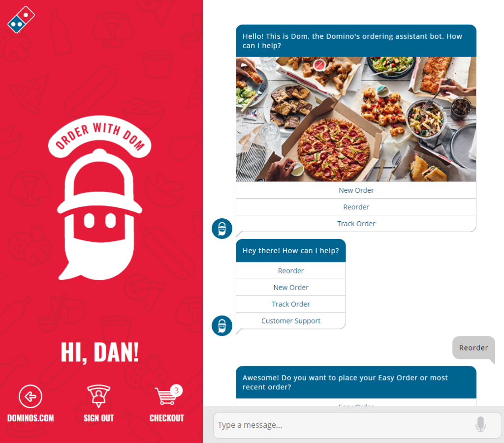
Domino’s Pizza is the leading pizza chain in North America, thanks in large part to its online tools. Their chatbot is their latest addition, and it’s one of the best bots out there.
What Was Great About It:
- It’s clear and efficient
- It remembers your recent orders
- It speeds up the ordering process (this order took less than 30 seconds)
#37.) Swet Tailor’s Facebook Ad (with Callouts)
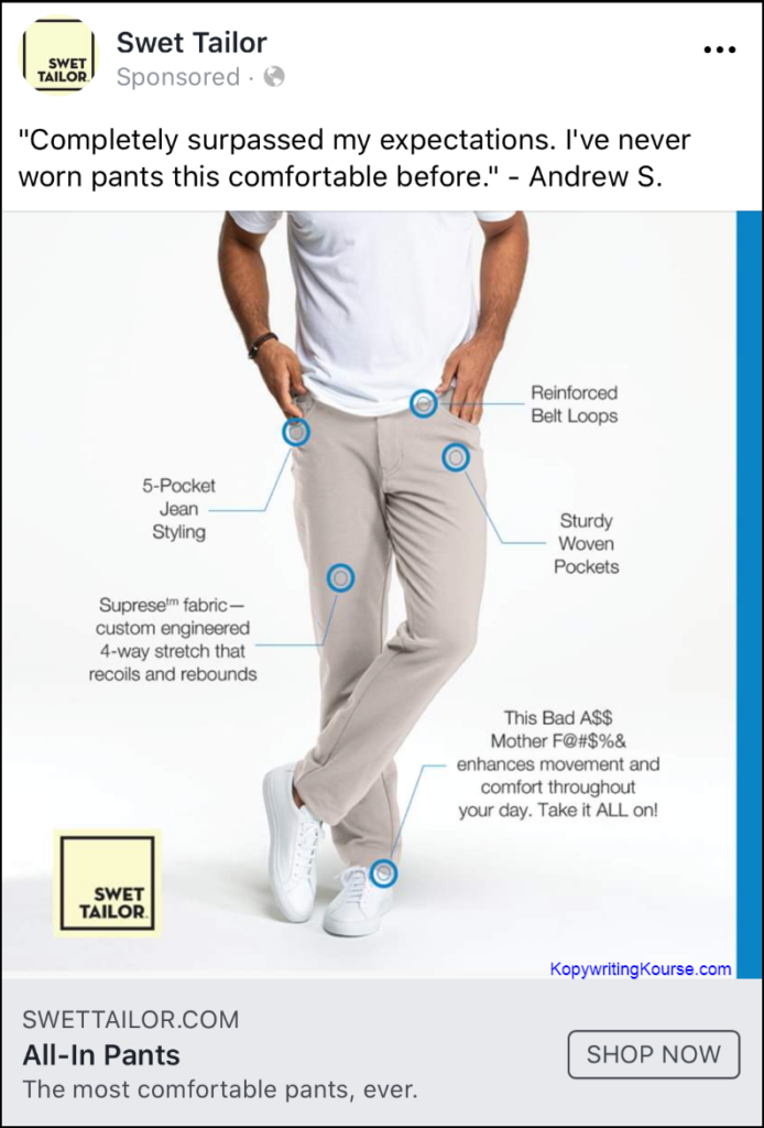
Instead of writing a complicated ad trying to describe something, Swet Tailor used a basic (but attractive) image with callouts highlighting the selling points of these pants.
What Was Great About It:
- It’s easy to read.
- The photo is simple and highlights the pants effectively.
- It’s funny.
#38.) The 4 Hour Chef Sales Page
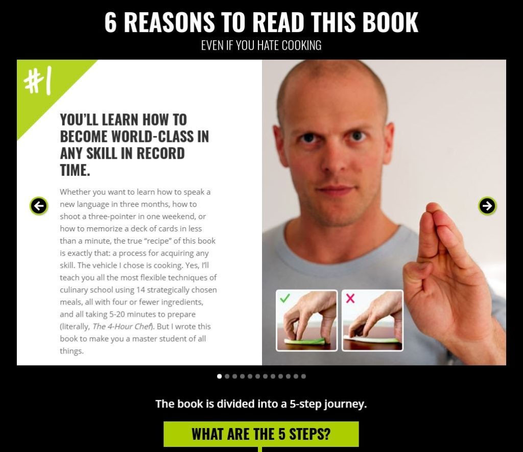
Tim Ferriss’ is known for taking complex ideas and breaking them down into simple, tactical steps - which is exactly how he designed the sales page for his book, The 4 Hour Chef.
What Was Great About It:
- Highly relevant benefits laid out like pages of a book.
- Explainer images that do just enough to get you curious
- A 5-step “journey” that outlines a reasonable path to Ferriss’ big promises.
#39.) Tuft and Needle Sales Page (12 Reasons Why…)
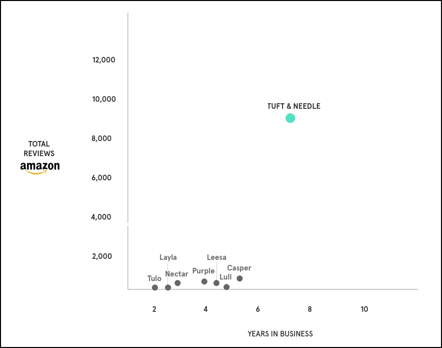
Here’s the full page: 12 Reasons Why You Haven't Bought From Us (Yet)
What Was Great About It:
- The page deconstructs 12 common objections to buying from Tuft and Needle.
- It uses clever images to hammer home each point (like the fact that they have 5-10X more reviews than their competitors.)
- It layers in testimonials and buy buttons throughout the page, without taking away from the sales points.
#40.) Apartment Follow Up Email

Most apartment management companies don’t follow up with potential tenants who come visit their buildings. Vista View is one of the few that does follow up. They send out this gentle reminder to apply (with a small discount on the application fee) a few days after a prospective tenant’s visit.
What Was Great About It:
- It’s really simple and direct.
- It’s time-relevant.
- It’s got attractive pictures of the model apartments
More Copywriting Resources & Guides:

3 Comments
Recommended Comments
Create an account or sign in to comment
You need to be a member in order to leave a comment
Create an account
Sign up for a new account in our community. It's easy!
Register a new accountSign in
Already have an account? Sign in here.
Sign In Now